-Cody, Amelia O., Sarah M.
Author Archives: codecodith
Gratitude Video
Link
Our final blog post! Here is a lovely video of myself. It’s lovely.
Vlog Post #13 from Cody Cunningham on Vimeo.
A Day in My Life
Here’s my podcast of myself!
-Cody
Mixing, Mingling, Shaking a Score
Jad and Robert are two rad fellas that host a radio show on radiolab (rehashing information you all know!). Now that that basic knowledge is now basic knowledge, I found this video on radio shows especially interesting because it shows HOW these THINGS come about. (“THINGS” referring to radio shows).
The way they describe the formation of their shows goes like this:
1. Find someone interesting to talk to.
2. Record talking to them.
3. Take snippets that are also interesting, and see how they work together.
4. Add themselves to the mix
5. Mix, mingle, and shake voices, music, and noises all around until something beautiful springs up – but always two guys talking.
6. Repeat.
These guys blend these noises – and lack of noises – so seamlessly that it makes me feel very comfortable. The way that there is a low bass that compliments their words in their introduction of their show, to the music that plays on a loop behind their words, to the sudden silences that subtly leave you feeling a tad empty without knowing why right away. These guys entice me to want to listen to more of their shows by seducing me with their other mediums other than just interesting content.
This video about podcasts was interesting because it was the only video – but it really showed me ways that podcasts can be especially interesting by directly stating how to do so.
I found the parts of the video most interesting were when they played short segments from one of their radio shows with the sounds they use. For example in the opening of their episode “Inheritance” from season 11, they do a lot of remixing with simple powerful sounds AND bounce back and forth between their two voices. The bass lines in the background remind me heavily of Everybody Loves Raymond, and put emphasis behind the words being said. They mention using the sounds they record as putting a score together, and come back to how in the end it’s just two guys talking. I think I may look into these guys a bit more, because they are mega interesting with their ideas* and such.
*Ideas as in just talking to interesting people, because why not.
-Cody
Making Magic Photos!
A very interesting technique I discovered inside Dreamweaver is using the rollover effect on images. This technique makes pictures EXCITING and EXPLOSIVE! Essentially it displays a normal photo until a mouse rolls over top of it, like a hover effect that make links interactive. This could be used for several different innovative and exciting reasons: interactive pictures like in my photo essay, the logo you have on your site (so people love it and want to come back), and, if you’re feeling it, before and after acne pictures!
So I bet you’re wondering how you can be this cool. It’s actually the easiest thing ever.
- Make your .html page and have it all fancy and spiffy except for your photo/logo.
- Have the spot where you want your picture to be and click there. You’re going to go to the tool bar at the top and hit
*insert > image > rollover image
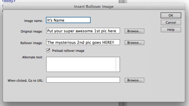
When you do this, a box will pop up that looks like this:
- As mentioned in the picture, it’s very self explanatory. The original picture gets open in the “original image” section. Similarly, the hover picture gets opened in the “rollover image” section. The title is what it will say in the blank box if your page doesn’t load, so it is important to add a title so if all else fails, people can visualize it.
- Hit okay, and wha-la! Your thingy is now an interactive neat mosquito thingy!
I tried adding a rollover photo to this post, but I couldn’t really figure it out. If you want to see first hand, visit my site:
http://thoughtsandgoodies.x10.bz/photoessay.html
If you’re like me, you won’t click on it so I’ll show you some side-by-side examples!
(They are actually not side-by-side. I’m not sorry.)
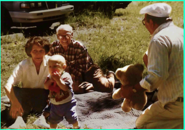
Original Picture:
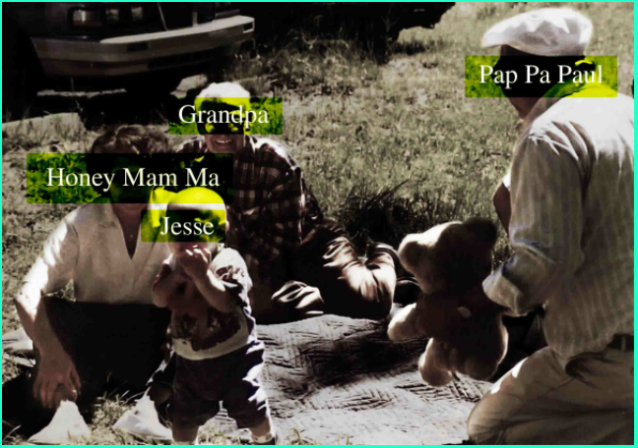
Rollover Picture:
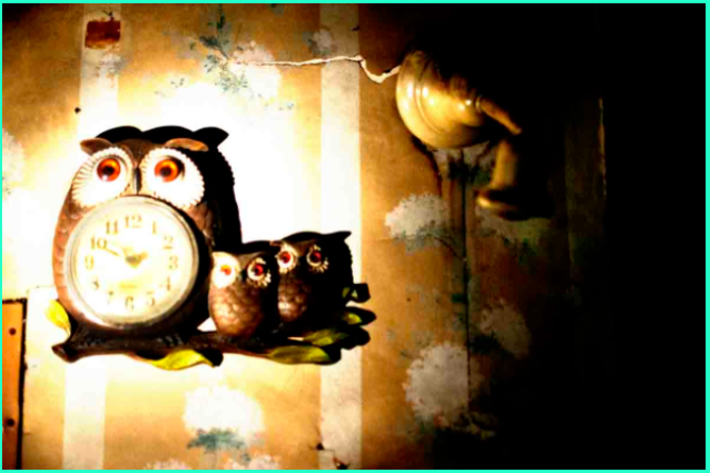
Rollover Picture:
-Cody
Let’s Go Rally!
After combing the web for some intriguing websites, I found that A LOT of them were boring with interesting content. More exploration landed me in the midst of a nifty website that fascinates me: http://rallyinteractive.com/
This website, called Let’s Go Rally, has a user interface that blows my mind. The main focus of this site was its fluid shape movements; it uses mainly triangles to display its content (which I’m still not sure is exactly).
When scrolling over these triangles, they move and display text saying “explore tid bits..”
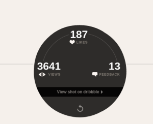
..and upon clicking, shape-shifts into a circle displaying how many views, likes, and feedback this particular post has received. It also includes a link that leads to said post.
The navigation of this site could not be any more user friendly. I always know where I am because there are only four different pages, that are clearly labeled and highlighted when inside: the home page, about page, a page showing clients, and a contact page.
So you click up at the top of the browser to switch pages:
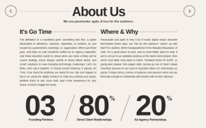
The top clearly has “About” highlighted.
I really like this minimalistic approach at navigation, as well as the simplistic colors of black and white, aside from the color in the triangles. This smooth sliding design creates a site that gives the viewer something interesting to see (their product) and information they are lusting for (the side pages) all navigational in a pretty appealing way. Moving pictures and links are ALWAYS something that makes me look at all of the links. I also really enjoy the way that the designers places their product at the bottom of every page, always available to the consumer.
This site, through its particular typography and text, is trying to relate to its customers, consumers, and viewers on a personal level. In the “About Us” section, they talk about being three normal guys just trying to signal boost their clients. In their client section, their header looks like this:
I would really love to capture this elegant fluidity that Let’s Go Rally exhibits. I don’t want my viewers to get lost or overwhelmed; therefore, I need to have something stimulating like the moving pictures, that remain ambiguous until clicked. I also really like the huge black font on a white background. It’s clear, crisp and sleek. Although animation like on this site would be extremely desirable, even just being creative with the changing pictures as links would be a great addition to a simple web design. Not that my site is going to be simple (no promises).
-Cody
Make your pictures POP with all that color and jazz
Say you have a neat picture, and you are not digging the color so much: I HAVE A SOLUTION! (An easy one, at that)
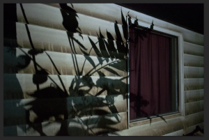
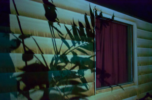
There is a way to take a boring photo and create an interesting color scheme by using another photo with colors you desire. This is using the “match color” option, originally designed to make two photos look like they were taken at the same time and place – I discovered ways to use it to make wild scenarios.
FIRST: Find a picture with an interesting color scheme – one that makes you drool a bit, but not so much you lick your computer. This could be anything from a famous work of art to an apple bursting with red energy. Open this picture in Photoshop.
SECOND: Find a dull picture that could use a splash of color; also open this photo.
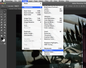
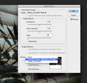
THIRD: Click though these menus: Image > Adjustments > Match Color.
This will open a box with a couple of settings to make your picture rock… or suck. Click on Source and select the vivid picture you selected to grace color upon your dull photo.
Three settings in there are Fade, Luminance, and Color Intensity. The Luminance setting adjusts the effect’s brightness. The Color Intensity setting adjusts the effect’s color saturation. (Be sure to have the preview box checked to see what this effect is doing to your picture).
LAST: When it looks all good, hit ok and BAM! You made a thing!
Before

After
Some links that helped me form coherent thoughts:
http://www.buzzfeed.com/peggy/incredibly-simple-photoshop-hacks-everyone-should-know (Number 5)
My Non-Rubber Ducky
Image

The Guy Who Just Remembered All The Things
Mr. Kramer, the human computer. A magnificent, and seemingly daunting task. After analyzing several photos, this whole tale took on an eerie atmosphere, as if Mr. Kramer is trapped in a never ending void.
Photo 10 of 15 illustrates these unnatural feelings the best. It is a picture of him locking up (or opening up) his shop at exactly the same time every morning. Some of the compositional elements that were key to this picture being a success include:
1. The action is framed by the building and sidewalk, drawing the viewer to Mr. Kramer in the center, and then to the action of unlocking/locking the door.
2. The depth is evident through the background being a busy street, blending into the horizon behind the protagonist. This creates a great depth behind Mr. Kramer, displaying that the whole world is still moving, changing, growing, while he is still in his routine – day after day – opening and closing at EXACTLY the same time.
3. This is a gesture shot, and comes at the perfect time in the series. The gesture is his relationship with the lock.
This picture creates the repetition necessary to make the viewer believe that this man really is going to be at this store, following each tradition, until he is is not longer able.
The feelings I received from this photo, after looking deep into it surprised me. It is impossible to determine a season from the picture alone; however, the color in the scene strongly suggests a more grime season: winter or fall. The wash over the photo almost makes it grayed out, draining the viewer of any good feelings that could potentially be conjured. This idea of a seasons installs the theme of repetition that the author is trying to drown Mr. Kramer in, because just like winter comes every year – Mr. Kramer follows a tight schedule. The time of the day is also very ambiguous here. He is wearing a jacket, so it must be chilly, but is this early in the morning, or just before dark? Either way, there is something dark about this ambiguity.
Was the author trying to be this ambiguous? Is this a lighthearted adventure through this man’s life – or a grim reality check on how he is muddling through an endless cycle?
-Cody

